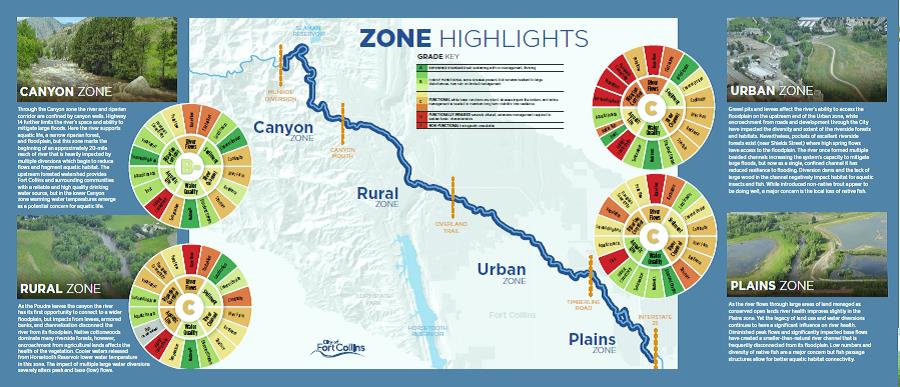
Making the Grade: The Poudre River Report Card
A diverse group of stakeholders are invested in northern Colorado’s Cache la Poudre River—some with seemingly conflicting interests. When Jennifer Shanahan, watershed planner for the City of Fort Collins, set out to create the “State of the Poudre” report card and overall health assessment, she knew it would be no easy task.
The full state of the river assessment drew from hydrological, chemical, biological and geomorphic data to create a detailed picture of the river’s health. The amount of data going into the assessment made for a truly comprehensive project—but it also made the process of sharing information more complicated.
For a more accessible version of the report, the city created an online mapping tool and the Poudre River report card—a printed summary, distributed to stakeholders collaborating on river management. All three were released in May 2017. As the name implies, information in the report card is conveyed through grades—A, B, C, D and F.
There is tremendous variability in the river system, however, and there was a risk that important information would be lost in the summary. Inspiration for a solution came from the University of Maryland’s various ecosystem report cards, which use color-coded symbols to communicate data.
The color-coding is intuitive, with green for an “A” grade and red for an “F.” Inner circles of a color wheel list the overall grade and corresponding color, and a segmented outer circle lists color-coded grades for specific areas. “It really allows us to tell the whole story,” says Shanahan.
The assessment and report card will convey a picture of today’s river health compared to conditions needed for a healthy river. One goal is to foster communication between the Poudre River’s diverse stakeholders as they discuss the river’s future, Shanahan says. “When you have a common perspective, it allows people to have a better dialogue.”
Find the report card at www.fcgov.com/poudrereportcard.
A Dashboard for Restored Streamflows
In April, the Colorado Water Trust, the nonprofit that works with Colorado’s Instream Flow Program to restore streamflows, launched a real-time online dashboard to show how much water its projects are putting back in rivers and streams. The dashboard features an aerial map of Colorado with points that are shaded to correspond with specific projects and associated flow data.
“We wanted to find a simple, immersive, interactive tool to display our project data to stakeholders,” says Mickey O’Hara, water resources engineer for the Colorado Water Trust. A chart shows how much flow was restored by each project on any given day, with a link to the full story on the project.
The dashboard displays an incredible amount of detail: Viewers can zoom all the way in on the map to see projects happening in or near their own backyards with real-time updates. Find it at www.coloradowatertrust.org/impact.
E. Coli’s Storyline
The Denver Metro Water Quality Assessment Tool teaches a variety of diverse stakeholders about E. coli in the Denver metro area. The tool, developed by Leonard Rice Engineers, is the creation of the South Platte River Urban Waters Partnership’s water quality workgroup.
The tool includes a data explorer, map and storyline, which allows for an interactive experience. Using the E. coli storyline is like paging through a book that provides a broad overview about the bacteria, with information becoming more detailed the deeper a viewer dives.
“What we really tried to do with this is provide some context for users that might not be super familiar with water quality data,” says Ben Tyler, lead developer of the tool at Leonard Rice. Ultimately, the Urban Waters Partnership hopes the tool will be equally useful to a concerned citizen, a policy maker, a teacher or a student. And there’s more to come: the E. coli storyboard is just phase one of a larger project. Phase two will add additional water quality storylines to the landing page, to include information about pharmaceuticals, nutrients and total dissolved solids. Find the dashboard at thewaterconnection.org/wq_tool.
 Print
Print